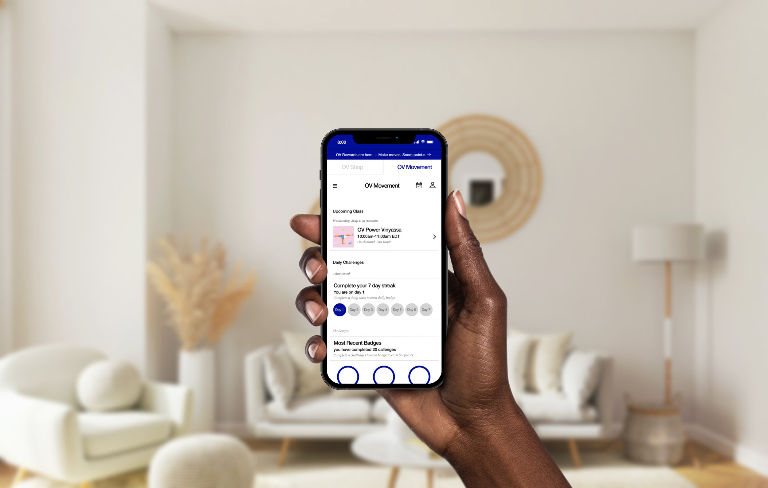
OV Movement
GA Design Challenge
Outdoor Voices
Project Team
Cesar Elias, Midori Mukumoto, Adam Li, Nicole Schaffer,
Role:
UX | UI Design
Overview
Outdoor Voices, is a clothing company that focuses on women’s and men’s athletic apparel with a mission to get the world moving. By freeing fitness from performance and bringing play back into everyday life, OV is building a community of Recreational enthusiasts who believe #DoingThings, moving your body and having fun with friends is the surest way to a happy, healthy life.
There has been a major increase in the amount of customers using mobile applications to easily access virtual workouts due to COVID-19 gym closures. Outdoor Voices needs a way to establish user need and create a mobile prototype that allows users to attend live and on-demand fitness classes and interact with the online Outdoor Voices community in order to expand the lifestyle brand.

01 User Interviews
We started with users interviews to empathize and learn how users view fitness and how they are working out.
We outreached and interviewed seven different self-proclaimed fitness enthusiasts to gain insight into their needs, motivations and frustrations, to help shape the app solution.
02 Affinity Mapping
Following our user interviews, we synthesized our findings based on what users were saying about their goals and frustrations.
What users were saying:
“I’m motivated to workout because It is good for my mental and physical health.”
“When taking a class I like convenience and guidance in a class setting”
“I want my fitness classes to be more affordable and flexible with my work schedule.”
“I feel connected when I create a social dynamic within my fitness community.”
“I set a schedule for my fitness routine that works with my busy lifestyle.”
“I want to see inclusivity in the athleisure -wear I buy and the fitness classes I take.”

03 Personas
With all the data we were able to create personas and identified key needs and goals for our targeted user.
Key focus areas of user needs
Class flexibility
Classes that can easily fit into their busy schedule.
Options to workout on demand at home.
Different classes to spice up workout routine.
Inclusivity
Discover workout regimens that cater to their fitness level.
More affordability to allow all users to participate.
Connect with other fitness members in a judge free zone.
Users need to feel motivated by fitness instructors without feeling judged.
Problem Statement
Creating an exercise regimen can take time, taking into account users’ busy schedules, fitness levels, social comfort, and affordability. This leaves the user feeling discouraged, excluded, and overwhelmed.

04 Sketch and LoFi
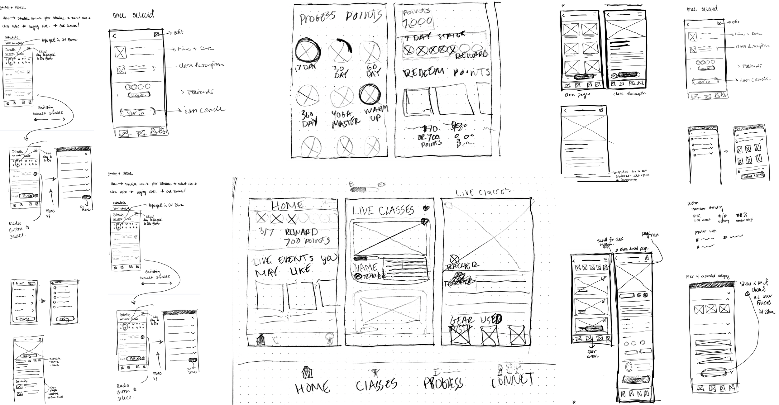
We sketched possible solutions that will help user’s needs and goals . it was a quick way to get ideas from one and other and design solutions.
The Key design areas
Dashboard: Where users could see upcoming events and their progress recorded in achievements.
Filter for Live and On demand Classes : We want to give users the flexibility to pick the best class that fits them. Users can pick filter through class time, duration, instructor, and difficulty,
Class Page and Sharing: Class descriptions would have class difficulty instructor and which one of their friends had taken that class. They also had the availability to share the class with friends
Reward page: OV already has a reward program. it is only fitting to expand on it and reward users for using the workout courses. users would get discounts that they can use in the outdoor voices Store.

05 Hifi Prototyping to the test
Outdoor Voices already has a strong style guide and library that was vital to maintaining the OV brand and in creating the “OV Movement”. We took elements from their existing website and native app to create the mobile web version.

Responsive Design
Most of our users will use OV movement on their mobile devices. To best fit our users needs, we took a mobile first responsive design approach.
To fit into the current layout and design of the existing OV e-commerce site, We decided to use a combination of the column drop and tiny tweaks layouts for the online video platform.
Starting from the top, we Implemented a “tab-like system” for users to toggle between the OV e-commerce site and the OV fitness platform. The width of the global navigation changes in width depending on the screen. Below this, the main navigation condolences down into a hamburger menu as the layout changes from desktop to mobile. The content underneath the navigation adjusts in width depending on the screen it is displayed and the information in the foot stacks on top of eachother.
Filtering and Sharing Classes
We asked users to show us how they would locate and take a Live "Endorphin Hour: Barre Burner" class with instructor Kayla.
keeping Jasmine’s needs in mind to Connect with other fitness members, we added a way for users to share a workout together with friends. In this case it’s jasmine's friend Jasper
Take classes, Get rewards
We asked users to show us how they would locate and take a Live "Endorphin Hour: Barre Burner" class with instructor Kayla.
keeping Jasmine’s needs in mind to Connect with other fitness members, we added a way for users to share a workout together with friends. In this case its jasmine's friend Jasper
What We learned
Searching
Some users were confused searching for virtual classes on the mobile website
Locating/Selecting
Most users were able to find a specific instructor and select the instructor’s class
Clickability
The main frustrations users had were the clickability of the hamburger menu and the OV movement button
Sharing
Most users were able to share a specific class with a friend of their choice
07 What is next?
Opportunities
Create a more intuitive and direct path to reduce navigational error.
Create a better text hierarchy to make wayfinding and call to action easier for the user.
I would like to explore more ways of showing user progress to keep them motivated to reach their end goals.

